
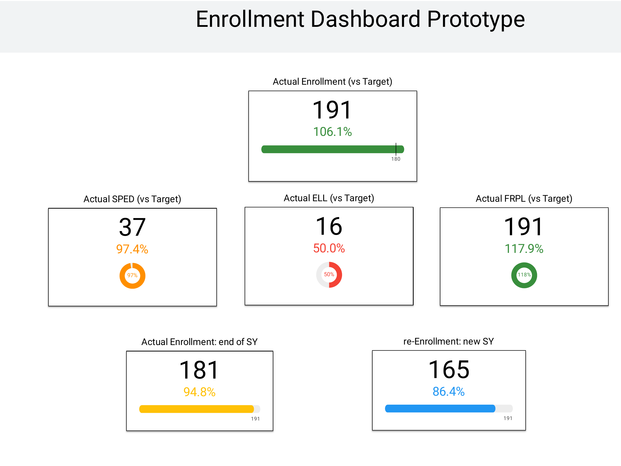
A few years ago I built a school-performance dashboard in Looker for a charter network. It was sophisticated. Meter charts for percentile readings. Multi-layered filters. Polished visual treatment that took weeks to get right. I was proud of it.
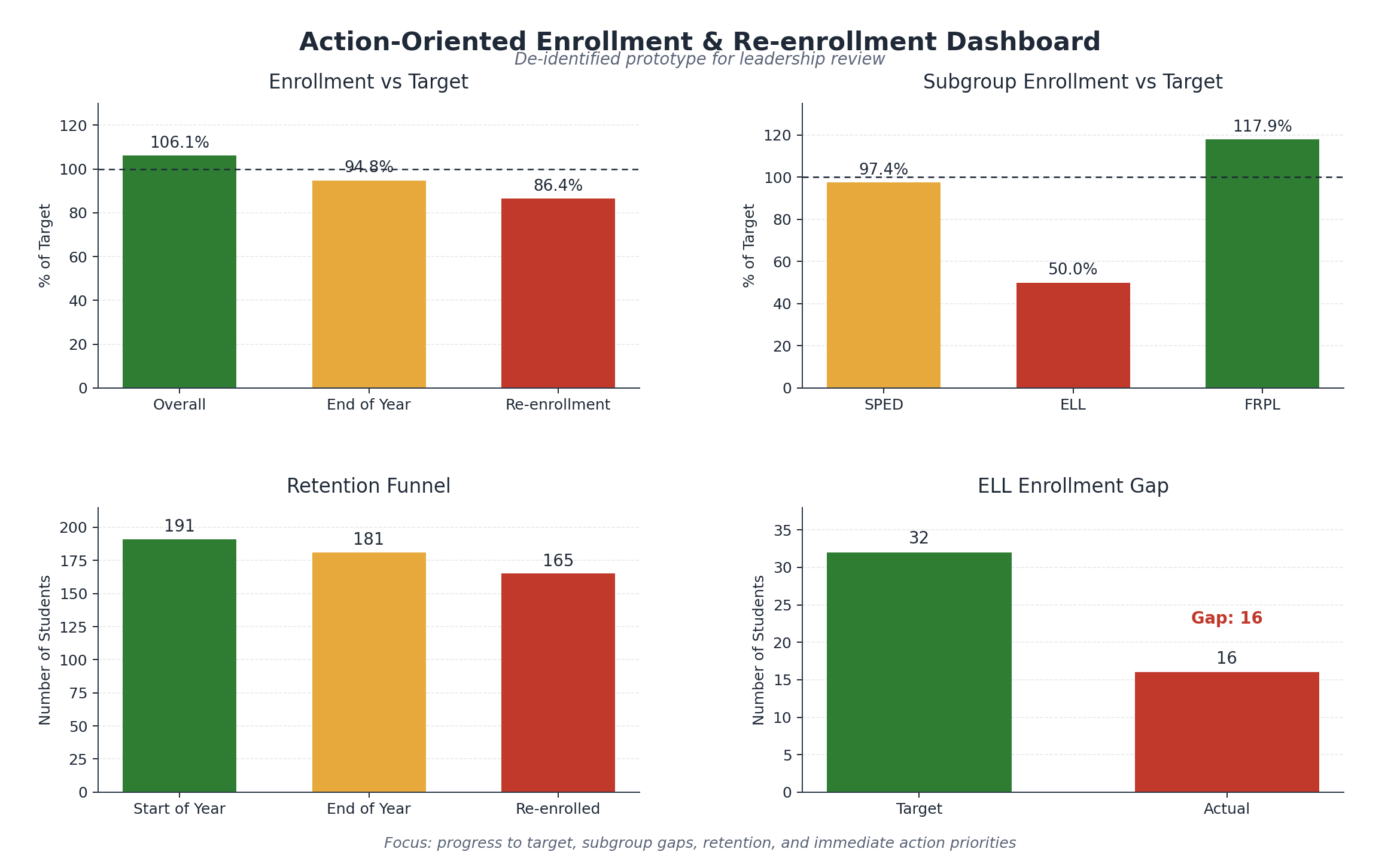
For my Stanford AI-Driven Leadership capstone, I put a similar dashboard back in front of GenAI tools (ChatGPT, Claude, Gemini) and asked them what they would change. The redesign was uglier than my original. It was also clearer to school leaders. The meter charts went away. The filters got fewer. The headline metric got bigger and earlier. The dashboard turned into something a busy principal could read in fifteen seconds and act on.
I had been designing for sophistication. The AI tools were designing for action.
That gap is the one that matters in mission-driven analytics: the gap between the dashboards data teams build because they are satisfying to make and the dashboards decision-makers use to decide. And GenAI tools, used the right way, are surprisingly good at exposing it.
This is what came out of the four-phase capstone. The discipline of letting AI propose first changed the work.
The discipline: AI proposes, human curates
The traditional dashboard-building pattern goes: analyst pulls the data, designer drafts the layout, dashboard-builder implements, stakeholder reviews. Each step adds aesthetic and analytic preferences. The output reflects what the data team wanted to build, often more than what the stakeholder will use.
The pattern I now use looks different.
- 01Hand the dataset to a GenAI tool with the question. “This is school-level data on attendance, mastery, persistence, behavior. The audience is school leaders deciding which two schools to visit this week. What should they see?”
- 02Take the AI’s first proposal seriously even when it’s uglier than what you would have built. The AI won’t reach for a meter chart unless asked. It will reach for the simplest visualization that answers the question. That simplicity is usually what the stakeholder needs.
- 03Curate. Don’t rebuild. The AI’s proposal is the starting point, not the deliverable. The data team adjusts for tone, brand, governance, edge cases. But the structure (what is prominent, what is secondary, what is omitted) is anchored on the AI’s reading of what the audience needs to see, not the data team’s reading of what’s satisfying to build.
This is closer to user-research methodology than to traditional BI design. The AI is acting as a fast proxy for the stakeholder’s cognitive needs. It hasn’t spent five years in your design reviews, which is what makes it useful at this step.
Where each tool fits in the discipline
The tools have different strengths inside this workflow.
ChatGPT, with its data-analysis tooling, is strong at the first proposal step. Hand it a dataset and a question; it produces summary statistics, suggests metrics, and prototypes a structure. The analyst’s job is to interpret the proposal, not to start from scratch.
Claude is strong at the curation and narrative-overlay step. Once the dashboard structure is clear, Claude is better at writing the audience-appropriate headline copy, the metric definitions, and the interpretive callouts that turn a chart into a decision surface.
Gemini is useful when the question pairs internal data with external context. Recent research, sector benchmarks, regulatory framing: the search-augmented variant handles those when they come up.
These specific advantages will shift as capabilities converge; that is already happening. The discipline doesn’t shift. The discipline is: let AI propose what the stakeholder needs to see before the data team’s preferences lock in. Curate from there.
What this changes about data-team workflow
When AI is positioned as design-collaborator-first rather than as content-generator-last, three things shift.
The first deliverable gets faster. A first-draft dashboard can go from days of design iteration to hours of curation on top of an AI proposal. The team’s bandwidth concentrates on the judgment calls (what is right for this stakeholder, what governance demands, what brand voice requires) instead of on building from a blank canvas.
The aesthetic-vs-decision tension surfaces earlier. When the AI proposes the simplest viable chart and the data team wants to add a more sophisticated one, the conversation is now explicit. Is the sophistication serving the decision, or serving the team’s desire to build something interesting? That is a productive conversation to have early instead of after the dashboard ships.
Stakeholder interpretation becomes part of the design process. AI proposals are easy to test against actual users. Does a school principal read this faster than the original? That is a question you can answer with five principals and a week, which is most of the point.
What the discipline cannot replace
The AI proposal is rarely the final answer. Three things still require human judgment.
Brand and tone. The AI doesn’t know your organization’s conventions, the words your audience trusts, the colors you’ve standardized. Curation owns that.
Edge cases and governance. The AI proposes from the dataset it sees. It doesn’t know which subgroups need cell suppression, which metrics have known data-quality issues, which interpretations would mislead a board reader. The data team owns that.
The question itself. The AI is great at proposing how to display an answer once it has the question. It is worse at deciding which question matters most. The analyst keeps that call; it’s the part of the workflow that hasn’t softened under any tool I’ve tried.
The reframe
The traditional dashboard-design conversation centers on what the data team can build. The discipline I’d recommend now centers on what the audience can read in fifteen seconds and act on. That is the difference between building for the immediate task (show every cut of the data with all the craft the team can bring) and building for the intended outcome the dashboard exists to support: a better decision, made sooner, by the person it was built for. A dashboard can be flawless at the first and useless at the second. AI tools help here not because they are better designers, but because they don’t share our aesthetic biases. Letting them propose first surfaces the gap between sophistication and usefulness, and most data teams default to the wrong side of that gap.
Beautiful dashboards aren’t the same as decision-driving ones. AI tools are a discipline against our own biases. Use them that way.
And the discipline generalizes well past dashboards. Design every surface backward from the decision it is meant to change, not forward from the data you happen to hold. Ask it of a report, an alert, a model’s output: what decision does this serve, and does it measurably move it? The fifteen-second dashboard a principal can act on is just one surface answering that question honestly. From fragmented to decision-ready is the distance a data team closes when it stops designing for itself and starts designing for the decision.
Written May 2026 for the Analytic Bytes Library. Tool capabilities and product names cited reflect that period, and capabilities are converging quickly. The discipline it names — let AI propose what the stakeholder needs to see, then curate — is intended to outlast specific tool advantages.
Questions, pushback, or a problem that looks like this one? Write to chai@analyticbytes.systems.