
The headline that hides the signal
Let’s start with the good news, because it is real. Across the younger age bands, suicide rates fell between 2021 and 2024, and not slightly. Ages 10–14 down about 16 percent. Ages 15–19 down 13 percent. Ages 20–24 down 13 percent. Ages 25–34 down 12 percent. Four bands, every one of them moving the right direction.
Now split the same dataset differently. The mid-life bands moved the other way over the same three years: ages 35–44 up roughly 3 percent, and 45–54 up about 3.5 percent. The decline among the young and the rise after 35 are happening at the same time, in the same country, in the same data.
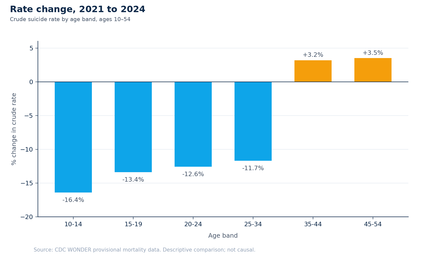
A single national rate blends those opposite movements into one number, and because the youngest bands are falling fast, that number still reads as progress. The blend hides the reversal underneath it: for every age band past 35, the trend has already turned. An average cannot tell a funder that, and a funder who reads only the average will not know to look. The lesson isn’t really about age. It is that any rolled-up number is a decision hazard. It blends signals moving in opposite directions, and the blend erases the contrast a resource decision depends on. You have to disaggregate before you can allocate. Age is one cut; the cut this note is about is harder.
Two signals, not one
When prevention dollars get prioritized by geography, the working number is almost always burden: the state’s overall suicide rate, deaths relative to population. It is the obvious signal, and a sound one. It answers a real question: how large is the problem here.
It is not the only question. The second signal is disparity: within a state, how much higher the rate runs for the most-affected racial group than for the White population. Expressed as relative risk, a value of 2.0 means that group’s rate is twice as high. Disparity doesn’t measure how big the problem is. It measures how unevenly it falls.
Burden and disparity are different instruments, and they answer to different commitments. A funder optimizing to prevent the most deaths leans on burden. A funder optimizing to close the widest gap leans on disparity. Most prioritization exercises pick one, usually burden, because it is the number that sorts cleanly into a ranked list, and never see the other at all.
The map burden draws, and the map disparity draws
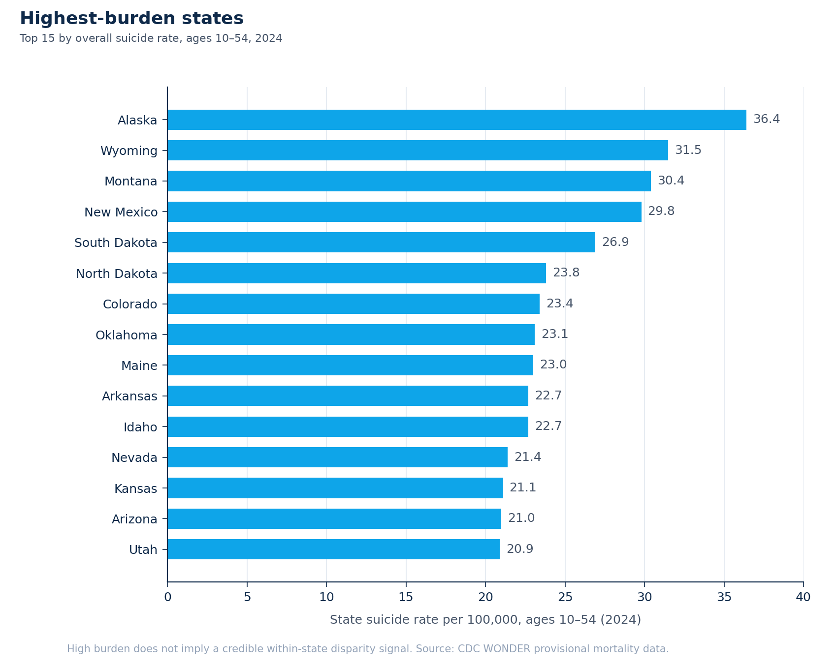
Rank states by burden for 2024, ages 10–54, and the top of the list is Alaska (a rate of 36.4 per 100,000), Wyoming (31.5), Montana (30.4), New Mexico (29.8), South Dakota (26.9), then North Dakota, Colorado, Oklahoma, Maine, Arkansas, Idaho. It is, broadly, a Mountain-West and rural map.
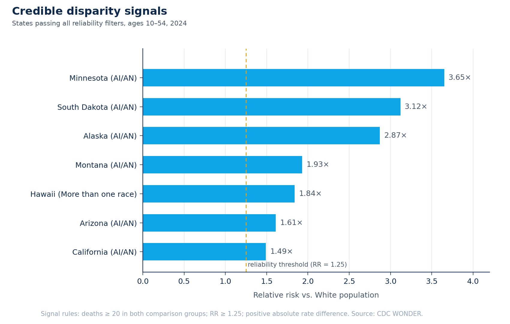
Now rank by disparity instead. The strongest reliable relative-risk signals are Minnesota (3.6×, the rate for American Indian and Alaska Native residents against the White rate), South Dakota (3.1×), Alaska (2.9×), Montana (1.9×), Hawaii (1.8×, here for residents identified as more than one race), Arizona (1.6×), and California (1.5×).
The two lists overlap in some places and split hard in others. Minnesota and California both carry serious disparity signals while sitting at or below the middle of the burden table; a burden-only funder never sees them. Wyoming and New Mexico sit near the top of the burden table with no reliable disparity signal at the state level; a disparity-only funder never sees them. Same data, same year. Two different priority lists, depending only on which signal you let do the sorting.
One map, four groups
Put both signals on the same axes and the states sort into four groups.
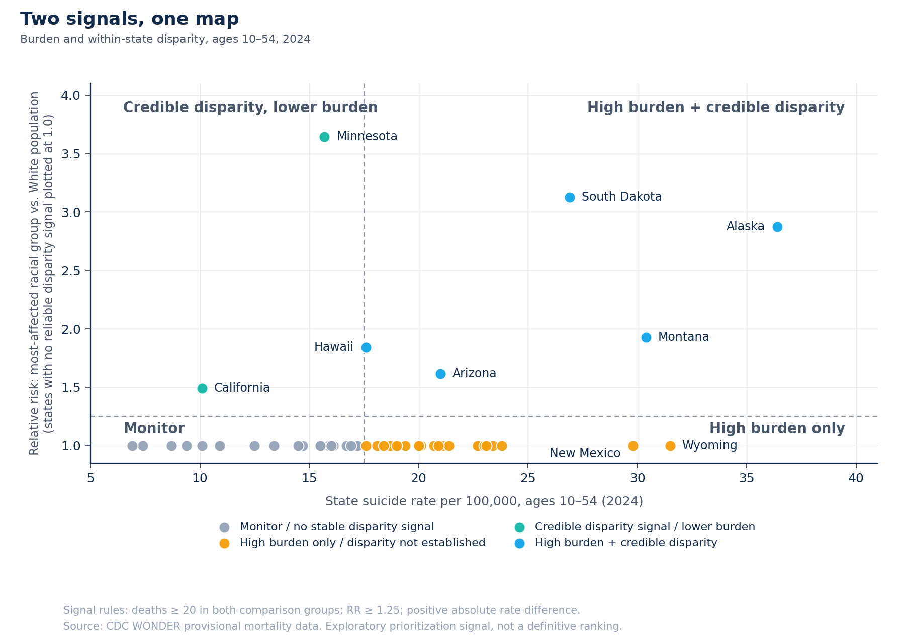
High burden and credible disparity: the upper-right. Alaska, South Dakota, Montana, Arizona, Hawaii. Both signals fire — a high overall rate and a measurable, reliable equity gap inside the state. This is the strongest and most defensible case for the next dollar, because it answers to both commitments at once.
High burden only: the lower-right. Wyoming, New Mexico, Colorado, North Dakota, Oklahoma, and more. A real, large problem, with no reliable evidence of a racial disparity at the state level. Investment here is well-justified on volume of harm alone.
Credible disparity, lower burden: the upper-left. Minnesota and California. The statewide rate is not alarming, but a specific population inside the state is carrying a markedly higher rate than its White neighbors — about one and a half times higher in California, more than three times higher in Minnesota. Investment here is justified on equity, and it is the case a burden ranking renders invisible.
Monitor: the lower-left. Neither signal fires reliably. Not “safe,” and not dismissed, just not where this dataset points a limited budget first.
One pattern runs through nearly every disparity signal on the map. In six of the seven states with a reliable signal, the most-affected group is American Indian and Alaska Native communities; in Hawaii, it is residents of more than one race. That is the clearest pattern in the disparity signals. It should shape not only where the dollar goes but who helps design what it funds; a prevention dollar designed for a community without their participation tends to underperform a dollar designed in partnership with them.
Where the next dollar goes
The framework doesn’t hand a funder an answer. It does something more useful. It makes the question explicit. A dollar can be spent to prevent the most deaths or to close the widest gap, and those are different ethical commitments that lead to different states. A serious allocation decision says which one it is optimizing, or splits the budget across both on purpose, instead of letting the choice get made implicitly by whichever number happened to be on the slide.
The overlap group is where the argument is easiest. Alaska, South Dakota, Montana, Arizona, and Hawaii satisfy both commitments simultaneously, and for most funders that is where a first tranche belongs. The harder and more revealing conversations are the off-diagonal ones. Is a Minnesota (an unremarkable statewide rate hiding a more-than-threefold disparity) a priority for your mission? A burden ranking already answered “no” on your behalf, silently, before anyone in the room got to weigh in. The quadrant’s value is that it puts the state back on the table and forces the answer to be given on purpose.
The honest version
This is a field note, and being precise about what the data cannot do is part of the method, not a disclaimer bolted to the end.
The figures are provisional. CDC WONDER mortality counts for 2021–2024 are revised over time; the picture will shift.
The disparity signals are reliability-filtered. A signal was counted here only if there were at least 20 deaths in both the comparison group and the White comparison group, a relative risk of at least 1.25, and a positive absolute rate difference. Below those thresholds, small counts produce rates that swing wildly from year to year, and an unfiltered ranking would be mostly noise wearing the costume of precision.
Absence of a signal is not evidence of equity. Several states, Montana and South Dakota among them, carry a suppression-caution flag: the comparison is real but thin, built on few enough visible groups that it should be read carefully. And “no reliable disparity signal” almost never means a state has no disparity. It usually means the affected groups are too small, in that state, for this dataset to surface one safely.
Most important: this is an exploratory prioritization signal, not an allocation formula. It is a map of where to look harder and ask sharper questions, not a number that should move money on its own. A measure that triggers investigation and a measure that drives allocation are not the same instrument, and treating the first as if it were the second is one of the most common ways well-meant analysis does harm.
What this is really about
Underneath the subject matter, this is a decision-systems problem. An organization has a real decision to make (where prevention resources go), and the data it holds is being read through a single number that cannot carry the decision. The fix is not more data. It is a framework that disaggregates the signals the decision rests on, shows them together, and stays disciplined about its own limits.
That move is the same whether the decision is a state’s prevention budget, a school district’s intervention dollars, or a clinical network’s capacity plan: name the decision, find the distinct signals it truly depends on, and refuse to let one rolled-up average stand in for all of them.
The next dollar gets spent either way. A framework like this one doesn’t spend it for you, and it shouldn’t. What it does is make sure that when you spend it, you were looking at the whole map: both signals, and the honest edges of what the data can and cannot say. From fragmented to decision-ready.
This piece discusses suicide. If you or someone you know is struggling, the 988 Suicide & Crisis Lifeline (call or text 988) is available 24/7 in the US.
Exploratory analysis of CDC WONDER provisional mortality data, 2021–2024 (ages 10–54). Written May 2026 for the Analytic Bytes Library. This is a signal framework for strategic prioritization, not a causal analysis, an epidemiological ranking, or a definitive allocation system. Reliability filters are described in the text.
Questions, pushback, or a problem that looks like this one? Write to chai@analyticbytes.systems.